Showing posts with label design. Show all posts

Monday, November 05, 2012

Potato race

These boys were spectators at a potato barrel rolling contest held October 1940 in Presque Isle, Maine. Jack Delano attended the event to photograph it for the Farm Security Administration.


I'd guess that Delano attracted the attention of the boys before he took their picture. As these two details show, they seem happy to be photographed as much as they're happy to have climbed to an ideal viewing spot.


In one of his first assignments for FSA Delano had used his camera to document laborers and laboring communities along the U.S. east coast. Starting in Florida, he'd worked his way to the nation's north-east estremity — Aroostook County along the border with Canada. All his photos in this set come from the FSA/OWI Color Photograph collection in the Prints and Photographs Division, Library of Congress. As usual, click to enlarge.

Although this set of photos shows us the contest itself, Delano seems more interested in the people who turned out to watch it.
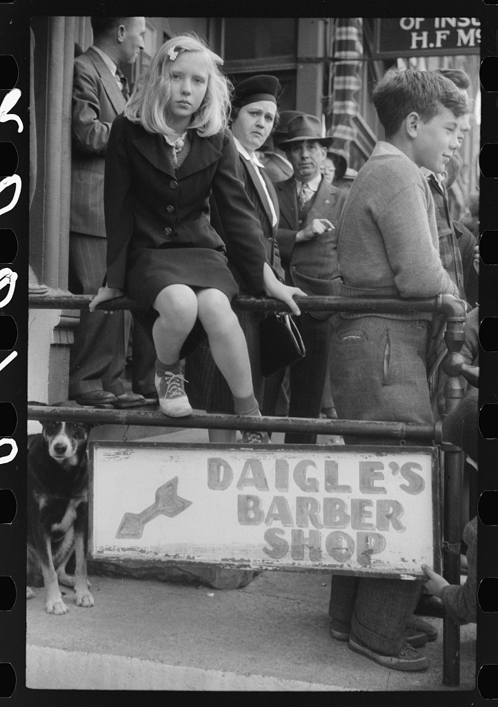


In the following photo, the boy who's looking at the camera would probably have been happier mingling with the kids on the roof of Chesley's Electric Service.


The next photo seems to have a post-modern sensibility. It's not about the event or even about watching the event. It seems to some degree to be an abstract display of contrasting tones and textures and an exercise in handling negative space (the light colored areas, particularly among ankles and feet) but basically I suspect he wanted to see whether a photo of people's backsides would succeed, could be at all visually satisfying.

On the other hand it might have been a kind of inside joke. In an interview some 25 years later Delano said his boss would give detailed instructions before sending photographers out on assignment. He'd give them books to read and give them things to look out for, like "there is a certain drugstore on such and such a corner which has a certain thing in the window which you must be sure to find" and even "what kind of shoes" the people wear. He'd expect Delano to absorb all this information but he also expected him to be observant and to make his own judgment about what to shoot and how.*


The caption of this one says these girls are high school students who are participating by holding spuds on the ends of sticks. At left you can see a barrel sculpture, the "pototem pole."


The caption says the string that the Boy Scout is holding is the finishing line for the barrel race.


Here Delano shows the contest itself. Notice the news photographer on the back of the pickup truck and, just in front of him, the barrel with its potatoes. The caption says a full barrel weighs 200 pounds.
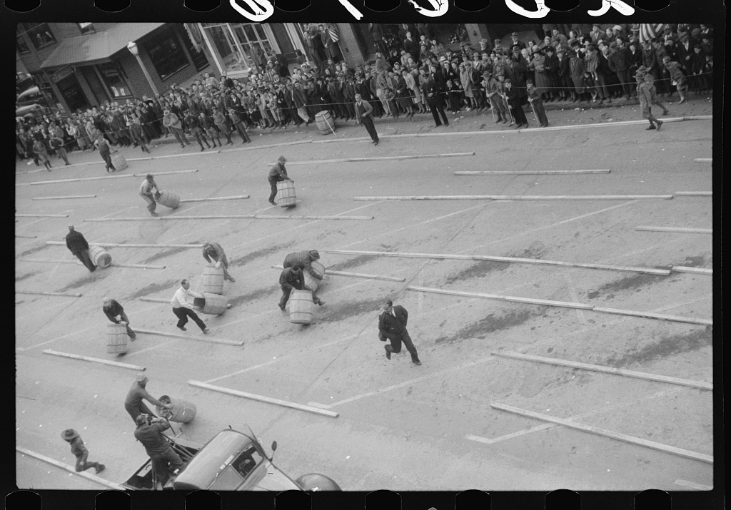

Detail from the previous image:


In this shot you can see more of the spectators and their reactions.


Detail from the previous image:


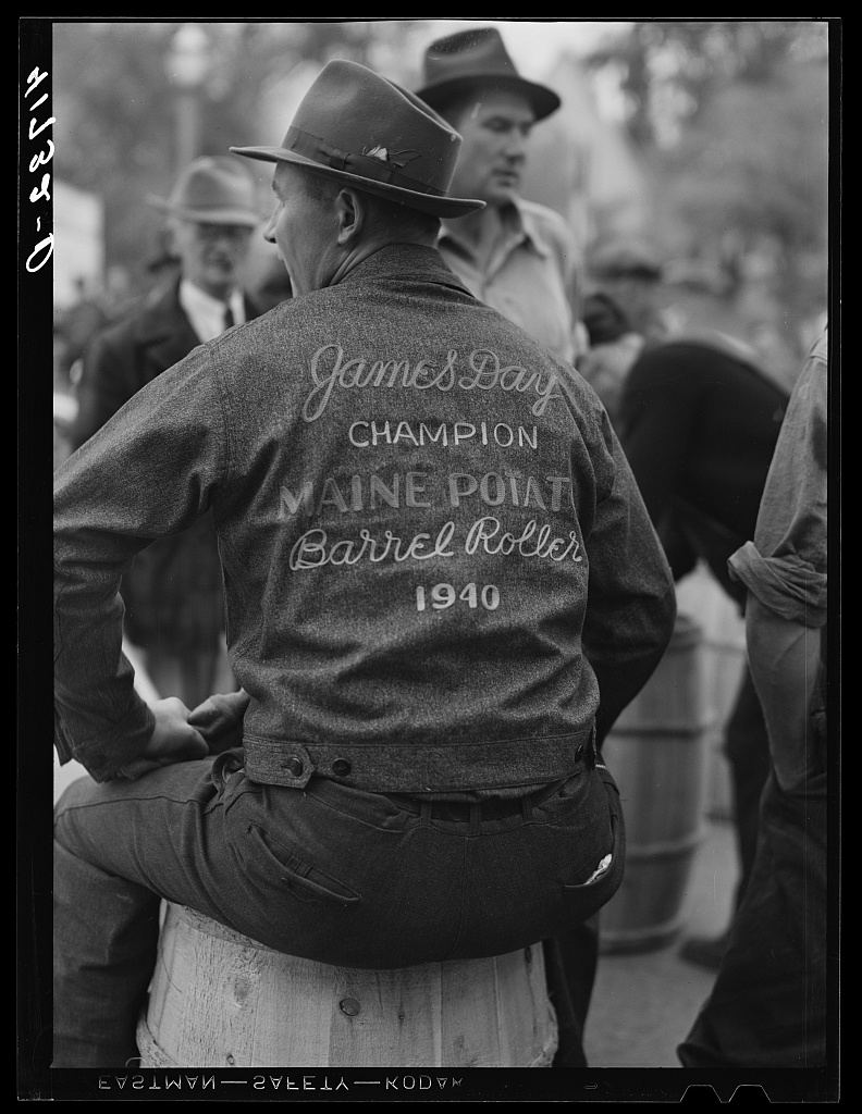
Here are two more photos from the many Delano took that day. The first is a poster advertising the contest and the second shows a champion roller. The caption says the latter shows "James Day, ace barrel roller and idol of Aroostook boys."

----------

*
Here's the relevant section of the interview:
[Interviewer:] We get these stories about how Roy would give you all sorts of books to read, and give you personal lectures and shooting scripts, and all that sort of thing. How much of that is correct?


JACK DELANO: Well, that's basically correct. I think that's quite true. Roy gave you the feeling that he knew more about everything that you did and, above all, ha knew more about America that you did, by far. And that's one of the things that I loved about Roy and one of the things I got most from him was a feeling about the United States, about America. This enthusiasm and love for the detail and the deeper meaning of everything American was something that he must have transmitted to everybody. He certainly did to me. In preparing for an assignment he not only gave us books to read, and all kinds of other things, but would talk and talk and talk in great detail about what you will find up there, and what you must look for, and there is a certain drugstore on such and such a corner which has a certain thing in the window which you must be sure to find, and so on. And he almost always would end up in saying, "But, of course, if you don't find any of these things, you do what you want to anyway." This is the way it always ended and frequently, after lengthy and detailed instructions and shooting scripts that Roy would develop, if you got up there and found that there was something else that interested you, and something else that you felt was more important and more pertinent, you just went ahead and did it; and wrote to Roy and said, "Look, Roy, it isn't like you said." This was perfectly okay with him because he wasn't imposing his ideas on you; he was trying to get you stimulated enough so that you would find out what was really there.

Interviewer: There was no dictation, I mean in this whole business he was simply trying to get you started. He didn't care if you went off on your own and took a different slant?

JACK DELANO: Not at all. On the contrary, he was trying to stimulate you to do that. In some of his letters, which we will show you -- I'm sure we'll find them this afternoon -- he would write in longhand these long letters in which he would work out for you a complete shooting script on what you should be looking for in Mauch Chunk, Pennsylvania or in Aroostook County, Maine. He would write in great detail about potato-picking, and what kind of shoes do they wear, and what kind of gloves do they wear, and where do they eat and sleep, and do all sorts of other things. But this was primarily a guide for you to open your eyes and be looking for these things. He wouldn't tell you what to photograph at all, ever.

-- Oral history interview with Jack and Irene Delano, 1965 June 12, An interview of Jack and Irene Delano in Rio Piedras, Puerto Rico, conducted 1965 June 12, by Richard Doud, for the Archives of American Art.

----------

Some sources

Jack Delano, 83; Depicted the Depression, an obituary in the New York Times by By Margarett Loke, August 15, 1997

Harvesting Potatoes, text by Richard E. Rand, images from Aroostook County Historical and Art Museum, Presque Isle Historical Society and Southern Aroostook Agricultural Museum

Aroostook County, Maine. October, 1940. Aroostook County, one of the largest potato producing centers in the world Photographed by Jack Delano for the Farm Security Administration. A collection of 160 photographic prints in the Library of Congress. Summary: Photographs show Aroostook County, one of the largest potato producing centers in the world. Aerial views of fields and farms, during harvest season. Tractor and horse drawn diggers. Crews of men, women, and children. Storage barns. Loading railroad cars for shipment. Isolated potato seed foundation farms. FSA community seed program. Demonstration of cutting and planting seed potatoes. Starch factory. Homes and families of French-Canadian farmers. Portraits.

Oral history interview with Jack and Irene Delano, 1965 June 12, An interview of Jack and Irene Delano in Rio Piedras, Puerto Rico, conducted 1965 June 12, by Richard Doud, for the Archives of American Art.

Farms in the Aroostook County, Me., Oct. 1940 : potatoes, Library of Congress

Farms in the Aroostook County, Me., Oct. 1940 : potatoes, Flickr photos from the Library of Congress

The Potato Culture of Aroostook County, Maine, USA

Aroostook Potatoes on aroostook.net

The Maine Potato Barrel Story
Extract: "The potato barrel is native to Aroostook, Maine's largest county; once the nation's largest producer of potatoes. While the other potato producing areas used burlap sacks, Aroostook farmers used the good, tongue and groove cedar barrel. It was used in the field during harvest and in the storage and sold by the barrel; they still are in Aroostook where farmers figure the cost of potatoes by the barrel. Although automated harvesters have taken over the bulk of the work, there are fields, even today, where barrels can be seen strung out in rows for the pickers to fill. Men, women and children-even grandparents bend to the task. An even today, children are excused from school for several weeks during this most important event."

Teams And Technology Educating Researching Aroostook County Tubers
Extract: "The history of the Maine potato industry reveals an industry of great change as illustrated by the number of farmers in business in the early 1900's compared to the early 2000's. The report titled, "Aroostook: Potato Capital of America" states there were over 6,000 farmers devoted to raising potatoes in Aroostook County, Maine around 1930-1940, while another report titled "A Study of the Maine Potato Industry: Its Economic impact 2003" reports only 586 potato farms in Maine in 1997."

Monday, May 23, 2011

color printing

In the 1890s, American printers produced some excellent color advertising. This ad for Newsboy Cigars was printed in 1894 by the Calvert Lithographic Co.


{Newsboy cigars. Manufactured by Brown Brothers, Detroit, 1894, Calvert Lithographic Co.; source: Library of Congress}

This one dates from about the same time.


{Drink Coca-Cola 5 cents, 189- , print: chromolithograph; summary: Print shows a well dressed young woman, wearing hat, white gloves, and pearls, holding up a glass of Coca-Cola, seated at a table on which is a vase of roses, the "Drink Coca-Cola" sign, and a paper giving the location of the "Home Office [of the] Coca-Cola Co." as well as branch locations; source: Library of Congress[1]}

Although digital imaging can be somewhat flakey, I imagine you can tell that these two make good use of a wide range of color tones.

Impressed on newsprint using high-speed, multi-cylinder rotary presses, advertisements in the local press couldn't attain such high quality. But, even in 1909, they looked pretty good, as this page from the New York Herald of 1909 attests. You can assume it looked a lot better on the day it came out. The highly-acidic wood-pulp paper on which it was printed will have deteriorated much more during the past century than the heavier stock on which the cigar and Coke ads appeared, and as the paper aged the colors will have grow dim.


{This comes from the Herald of 1909; source: NYPL Digital Gallery}

Newspaper color work from earlier in the 19th century is also surprisingly good. This example comes from a New York weekly, Frank Leslie's Illustrated Newspaper, in 1883.


{"North Carolina &mdash An Illicit Whisky Still in the Mountains Surprised by Revenue Officers," from a sketch by J.S. Hodgson, a page in Frank Leslie's Illustrated Newspaper for the week ending September 1, 1883; source: Shirley Stipp Ephemera Collection, D.H. Ramsey Library, Special Collections, UNC}

This one comes from more than a decade before.


{Grant at the capture of the city of Mexico by E. Leutze, made between 1860 and 1870; source: Library of Congress}

Many newspaper illustrations were what we call political cartoons. This patriotic example appeared in the New York Herald on January 9, 1898. It isn't usually identified as typical of the era's yellow journalism, but this cartoon does fit the mold pretty well. When it appeared the high-circulation dailies, such as Hearst's New York Journal were flaming American jingoism and the Spanish American War was just about to break out.[2]

{"Uncle Sam -- Now Let Some of the Other Fellows Invent Something" by Charles Nelan, New York Herald, January 9, 1898; source: Cartoon Research Library, Ohio State University}

This 1895 drawing shows a multi-cylinder color press. These presses printed multiple colors in one operation at high speed.


{source: flickr}

These presses were enormous and immensely complicated. Containing about 50,000 separate pieces, they were something like thirty-five feet long, seventeen feet high and twelve feet wide. Although they used only four colors, they'd have some 64 sources of ink, called fountains. Fed by huge rolls of paper, they build up a color illustration by overlaying first yellow, then red, then blue, one after the other. The paper wound its way through the press much too fast for the different impressions to be visible, but if they were you would be able to see what the following images show. Note that the fourth color, black, is not part of this somewhat simplistic demonstration of the overlay process.


{source:
Modern industrial progress by Charles Henry Cochrane (J.B. Lippincott company, 1904) }

Although the process was highly automated, a great deal of skill was required in creating the plates from which each impression would be drawn and setting up the press to insure that the plates and unrolling paper were precisely aligned.[3] In most cases the artist would create the original color work using pen and ink or brush and paint. The work would be photographed three or more times using color filters to isolate, respectively, the yellow, red, and blue tones, and their variants. By a process called photoengraving, the photographic negatives (all of them black and white) would be used to make at least three printing plates and these, in turn, would be used to make the stereotype plates that were attached to the rollers of the giant presses. Each stereotype printing plate would be inked with a separate color to impress the paper as it wound its way through the press.[4]

The cigar and Coke ads were not made on one of these presses. They were poster-sized placards meant for display in shop windows, on advertising kiosks, and the like. The Coke ad was made by a process called chromolithography. In the late 19th century, chromolithographs were called "chromos." They were color lithographs and their quality varied greatly, depending on the skill of the printers and the size of the project's budget. The best were costly and could be extremely faithful to the original. They were made either by repeated impressions of a flat sheet of paper against inked lithographic stones or by a rotary method called offset lithography. A book published in 1875 describes this process clearly and in some detail.[5]

This enlargement from the Coke ad shows the tonal gradations that could be achieved in a relatively high quality chromo print.


The Newsboys Cigars ad has more abrupt tonal gradations. Although the curator identified the ad as a lithograph, the enlargement I've put below shows that it has been reproduced via halftone process. While chromolithography was done on lithographic flatbed or offset presses, halftone printing could be done on letterpress printing equipment, the same type of presses that were used to publish daily newspapers. In halftone work, tonal gradations are conveyed by dots of pigment. When the dots are close together the eye sees relatively intense tones; as they're increasingly separated, the eye sees lighter tones of the pigment. Making high quality halftones is difficult and time-consuming, requiring exact registration of the paper through multiple impressions, but the process is nonetheless cheaper and faster than is high quality chromolithography. Half-tone illustrations could be inserted along with text on the pages of daily newspapers, but this would normally be done for black and white photographs rather than color pictures.[6]

Here is an enlargement from the cigar ad that's comparable to the one of the Coke ad.


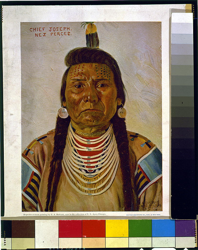
Compare this detail from a halftone reproduction of a painting of Chief Joseph made in 1897.


Here's the painting from which I've taken the Chief Joseph detail. Note that in this case the Library of Congress curator has identified the print as a halftone.


{Halftone reproduction of a painting by E.A. Burbank of Chief Joseph, Nez Percé chief, head-and-shoulders portrait, facing front, published by the Chicago Colortype Co., 1897; source: Library of Congress}


The New York Public Library has an excellent set of web pages describing and demonstrating chromolithography. Note in particular its sets of progressive proofs of a print called Prang's Prize Babies.

The two small crosses that you may have noticed on the Coke ad show it to be a type of proof. The crosses helped the printer determine that the registration was accurate as each successive color overlay was made. Once exact registration was assured, the crosses would, of course, be removed so as not to appear in the production prints.

-----------

Some sources:

The New Journalism 1865-1919

The Penny Press

Six thousand years of history see other blog post

The Daily Newspaper in America see other blog post

"Printing Presses" in The Encyclopedia Americana Encyclopedia Americana Corp., 1919

"The Development of the Rotary Web Press" in The American manual of presswork Oswald publishing company, 1916

Modern industrial progress by Charles Henry Cochrane (J.B. Lippincott company, 1904)

Color printing in wikipedia

History and present condition of the newspaper and periodical press of the United States by Simon Newton Dexter North (Govt. print. off., 1884)

American dictionary of printing and bookmaking by Wesley Washington Pasko (H. Lockwood, 1894)

History of Color Printing

COLOR PRINTING IN THE NINETEENTH CENTURY An Exhibition at the Hugh M. Morris Library, University of Delaware, Newark, Delaware, August 27 - December 19, 1996,curated by Iris Snyder

The wonders of modern mechanism, a résumé of progress in mechanical, physical, and engineering science at the dawn of the twentieth century by Charles Henry Cochrane (J.B. Lippincott company, 1900)

Chromolithography on wikipedia

"How Chromos are Made" in The living age, Vol 95 (Littell, Son and Co., 1867)

"Chromo-Lithography" in House documents, otherwise publ. as Executive documents, 13th congress, 2d session-49th congress, 1st session (Gov't Printing Office, 1876)

The half-tone process: A practical manual of photo-engraving in half-tone on zinc, copper, and brass by Julius Verfasser (Iliffe & sons, limited, 1904)

The chemistry of light and photography: in its application to art, science, and industry by Hermann Wilhelm Vogel (London, Henry S. King & Co., 1875)

Commercial engraving and printing, a manual of practical instruction and reference covering commercial illustrating and printing by all processes, for advertising managers, printers, engravers, lithographers, paper men, photographers, commercial artists, salesmen, instructors, students and all others interested in these and allied trades by Charles William Hackleman (Commercial Engraving Publishing Company, 1921)

--------

Notes:

[1] Wikipedia gives a bit more detail: '"Drink Coca-Cola 5¢", an 1890s advertising poster showing a woman in fancy clothes (partially vaguely influenced by 16th- and 17th-century styles) drinking Coke. The card on the table says "Home Office, The Coca-Cola Co. Atlanta Ga. Branches: Chicago, Philadelphia, Los Angeles, Dallas". Notice the cross-shaped color registration marks near the bottom center and top center (which presumably would have been removed for a production print run). Someone has crudely written on it at lower left (with an apparent leaking fountain pen) "Our Faovrite" [sic].'

[2] Contemporaries news readers didn't use the term yellow journalism at that time. To them it was yellow kid journalism, after Outcault's Yellow Kid comic strips, about which I've previously written (see New York Sunday comics in the 90s & aughts).

[3] A contemporary account describes the whole process in considerable detail: Modern industrial progress by Charles Henry Cochrane (J.B. Lippincott company, 1904). I've outlined the method of making newspaper text in a previous blog post: Newspaper Story.

[4] In practice, more than three printing plates could be used. There might be one for black and grey tones and another for brown. Where faithfulness to the original picture was important, such as with high quality fine art reproductions, more plates would be added for different prominent tones in the original.

[5] "Photo-Lithography" in The chemistry of light and photography: in its application to art, science, and industry by Hermann Wilhelm Vogel (London, Henry S. King & Co., 1875

[6] See "Halftones" in the same source, and:
HALF-TONE ILLUSTRATION OVERLAYING

By "half-tone," in so far as this relates to printing plates made by the photo-mechanical process, is meant all engravings, pictorial and otherwise, which have their grays or lighter tones produced or enhanced by mesh formations over the face of the engraving, whether these be conveyed through a "dotted" or "lined" glass screen — the usual mechanical manner of producing half-tone effects on this character of printing plate.
-- The Inland and American printer and lithographer (Maclean-Hunter Pub. Co., 1895)

Saturday, January 23, 2010

looking at pictures

I like photographs that draw my eye into the frame. I like the illusion of space in ones that use converging lines to give me a pathway into the back of the picture. Just yesterday I saw this dramatic example of the type. It comes from Londonist, a popular blog in the Gothamist Network.

http://londonist.com/attachments/London_Lindsey/TCR_210110.jpg
{Caption: Tottenham Court Road Tube by cicliced}

Londonist's current front page has a varient that I like even better — the pathway that curves into the distance.


{Londonist's credit: Photo by matthew black on flickr}

I did some searching on a popular photo site called pixadeus and came up with some further examples. This gallery page of my pixadeus examples on ImageShack contains results from pixadeus searches using the terms lane, street, and village. (At bottom of this post I've put a slide show of these images.)

I'm pretty sure the clichés of converging line photography are receding rails on railways, such as these:


{Pixadeus caption: Trees bent by the weight of ice from a winter storm line railroad tracks in Hinsdale, Mass., by risto}

Clichés though they may be, rails work well in photos. For example back at the beginning of the twentieth century an employee of the Detroit Publishing Co. made these converging rail images of New York subway construction. They're from collections in the Library of Congress Prints and Photos Div. As always, click to view full size.


{Caption: 14th St. subway station, New York, c1904}


{Caption: In the subway, New York, N.Y. c1904}


{Caption: City Hall subway station, New York, between 1900 and 1906}


{Caption: 28th St. subway station, New York, between 1900 and 1906}

-----------------------

Here is the promised ImageShack slideshow of the images I found on pixadeus.


------------------------

For more images of NY subway construction, see "Building New York's Subway" (1903)

-----------------------

I'm including this last photo from the Detroit Publishing Co. series just because I like it.


{Caption: Concrete stairway under construction, 23rd Street subway station, New York, between 1900 and 1906}